

Moltter Studio, by Trinos Technologies
Sector: AI decision intelligence
At a glance
Services: AI Agents People Can Trust, AI Design System
Duration: Three months
Team: Three FI people across UX, strategy and design, with the Trinos engineering team
The idea: A panel of AI experts that debates your decision before you commit.
What we did: We shaped the workflow and the decision matrix, which sets which kind of decision gets which panel, and which kind of answer. We designed the interaction for 12 product concepts, how every agent behaves, the decision report, and an AI design system.
The value: People can follow, question and check the panel, instead of taking one voice on trust. Trinos gets a product with trust designed in, and a team that builds new components with AI, inside the system.
12 concepts, one path
51 expert agents working as one panel, across 13 domains
1 design system that designers, developers and AI all build with
What needed to change
A CEO has to decide whether to hire a VP of Engineering. There is no boardroom to ask.
Moltter gives them one. Most AI tools give one answer from one voice. Moltter makes a panel of named AI experts debate the call first.

That creates a new problem. A panel that always agrees feels like an echo, and one that only argues feels like noise. It is hard to trust an answer you cannot follow.
When we started, Moltter was an early product idea. None of this was designed yet.
Who we designed for
The person making a big call alone: a leader, a founder, an investor. They need to see why the panel landed there, and where it split, not just the answer.
The question we designed around: How does a leader trust a verdict from agents they have never met?
The rules we designed by
Show the argument, not just the answer.
Speak in decisions, never in machinery.
Lead with the verdict. Let people open the depth.
Every agent has a role, a voice and a limit.
The work
01 - One path through twelve concepts
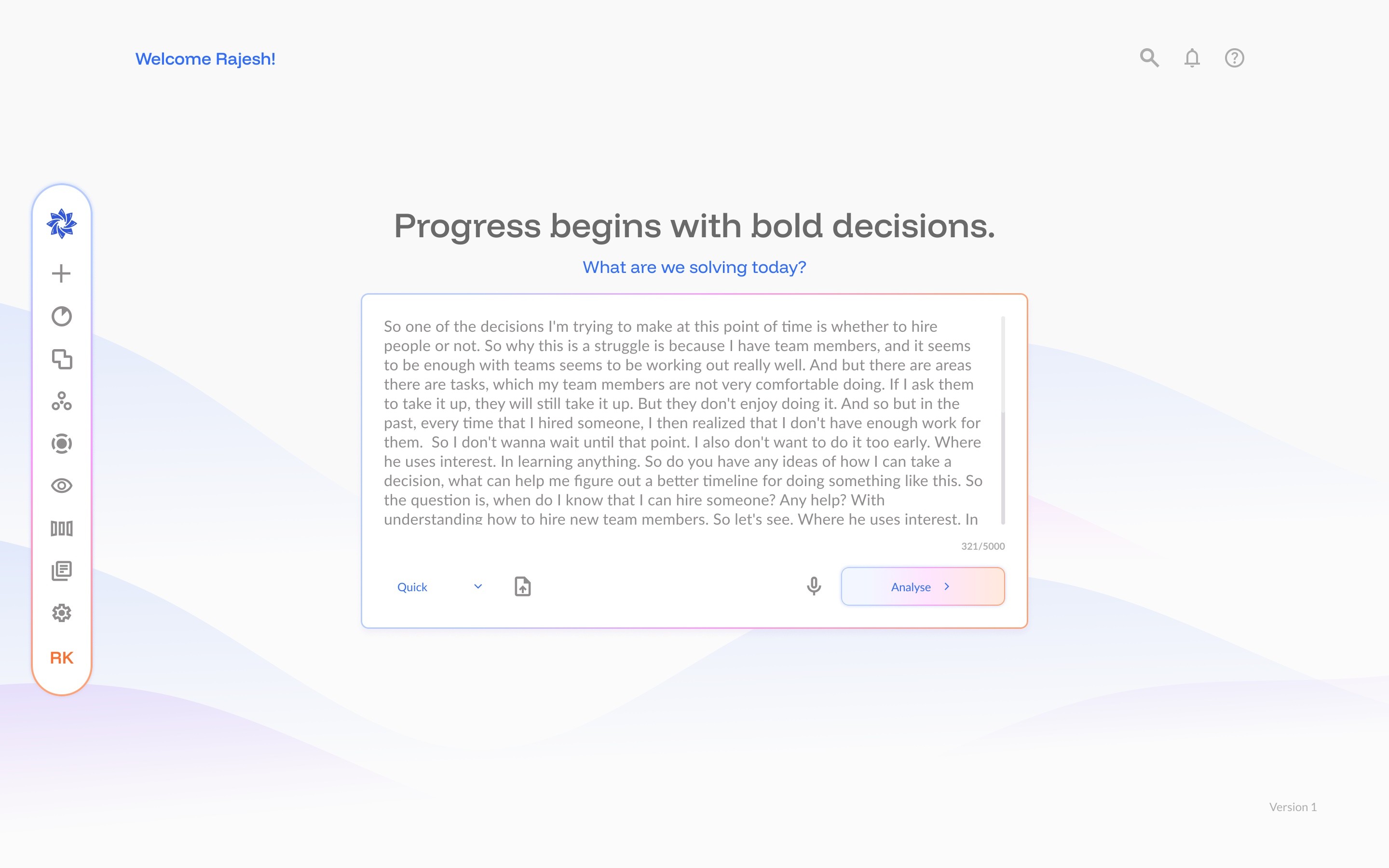
Every decision gets its own space. Inside it, one path: answer a few questions, meet your panel, write down your first guess, follow the debate round by round, then read the report. Twelve product concepts, from Decision Space to Track Record, each found a place on that path.
Why it matters: your first guess is written down before the panel speaks, so you can see later whether the debate changed your mind.
Instead of: twelve features as twelve places to look.
02 - Agents with a role, a voice and a limit
We designed how all 51 agents behave, speak and respond, so they work as one panel. Across three rounds, each takes its own position, questions the others, then says plainly whether it held or changed its mind, and why.
The Devil’s Advocate argues against whatever the panel starts to agree on, so the panel’s agreement is tested before it reaches you. Limits are designed in too: a calm answer when someone is upset, a gentle redirect when a request is not a decision, and a money warning that cannot be removed.
Instead of: one confident voice with no visible dissent.

03 - A report built for reading
The verdict and the panel’s confidence come first. The reasoning sits one step deeper, for anyone who wants it. Section links, a reading-progress bar and charts titled with their finding keep a long report easy to follow.
Refused: rewording the panel. Every paragraph of the deliberation appears word for word, and an automatic check confirms it. A tidy summary that changed the panel’s words would quietly break trust.
04 - A design system people and AI can build with
Thirteen agent domains, each in three shades, so one colour rule covers every agent. The system ships three ways: a Figma library for designers, a tokens file (the colours, type and spacing as code) for developers, and a Claude skill (instructions the AI follows) so anything made with AI stays inside the rules. It is written for machines as well as people.
Thinking and decisions
Key decision: Keep the disagreement visible. Points of Contention and the Reasoning Trace show who split and who moved, instead of smoothing the panel into one voice.
Learning: Colour alone was not enough. The red for high priority and the orange for medium were too close for colour-blind readers, so priority is always written in words too.
How we worked
We started from the product idea, while Trinos’s engineers built sign-up and onboarding alongside us. We handed over clean Figma files, a clustered PDF for development, and the design system as tokens and a Claude skill.
The shift
The person deciding
Before: No path through the product yet.
After: One path from question to report. The verdict first, the disagreement in plain view.
The Trinos team
Before: AI-generated screens and early mockups.
After: AI generates components inside the system. Designers still own the full screen.
What’s next
The Reports section, shaped by research into how different readers use a report
New product screens, built from the system
Known gaps: the library does not yet have loading or empty states, dark mode or phone layouts.
The honest line: AI now builds components inside the system, in production, but the full loop from user story to finished screen still needs a designer. It is too early for usage numbers; we will add them when Moltter has them.
